Friday 18 May 2012

Vintage maps and dresses


This map reminds me of a vintage dress I recently bought in Godiva, Edinburgh. 

The colours are similar and even the pattern seems strangely reminiscent of the map's.

The map is from the 1929 Junior atlas for Canadian schools by Edinburgh mapmaker Thomas Nelson & Sons. The dress, on the other hand, was bought a couple of weeks ago from Godiva, Edinburgh. But they're equally vintage. 

Saturday 12 May 2012

Communicate the old fashioned way

I love getting post. It happens so little these days: I come home to find a letter gracing my carpet or a package (not an anticipated, self-administered Amazon one) sitting on my table -- to be ripped open immediately.

So I was very happy to arrive home to this package from my grandmother today. It travelled by plane, I presume, over the Irish sea (coming from Belfast, Northern Ireland) and then probably by van to my door (in Edinburgh). There's something about physical transportation that makes the receipt of something more meaningful. 
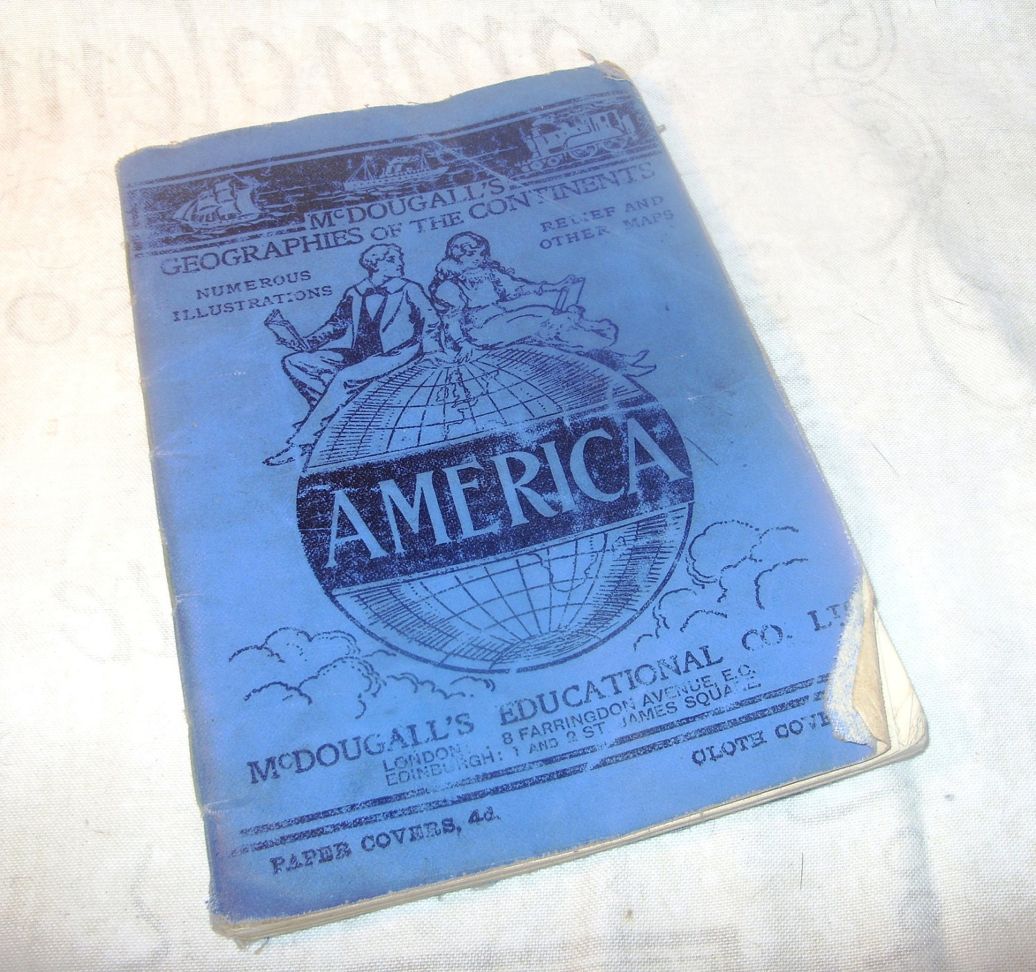
This week I was writing a paper about the transport of school atlases in the 1900s from mapmakers in Edinburgh to pupils in India. There were significant risks to this. As well as travel taking months there was always the chance that a ship and its cargo would be lost at sea. 
This picture shows the British ship "SS Clan Macmaster" in 1923, carrying cargo, including 3,000 copies of the Oxford University Press' Indian School Atlas, from Glasgow to Calcutta. This ship never reached its destination but was reported "wrecked off the isle of man", and the 3000 copies of the OUP's Indian School Atlas ended up at the bottom of the Irish sea. 
But when school atlases like this one did successfully move from Britain to the farther reaches of the globe, the recipients surely appreciated the physical distance traversed and the obstacles avoided in the process.
The world is becoming less tangible: we all send about fifty texts per day and about the same number of emails, make around seven hundred Facebook comments (am I right?) and maybe fit in a few 'tweets' (I'm for all of these things too). But when is the last time you sat down at a desk, with a hot cup of tea, a pen, or stylus if you're that way inclined, and inscribed a message for a friend or family member that would require some small physical effort, involve material apparatus and lead to physical transport from your door to theirs? If my eighty one year old gran can do it, so can you.  This package made my day. The moral of this story: send a REAL message to someone soon.

Saturday 5 May 2012

Own a 'McDougall'!

Here's to meaningless anecdotes...


It turns out my family may have been producing school atlases in the 1900s (the very thing I'm studying). Check out the school atlas for American schools: "McDougall’s [my name] Geographies of the Continents" (1903). McDougall’s Educational Company was a publisher in Edinburgh (where I now live). I would be somewhat exuberant if I was now writing about the atlases my great great grandfather once produced.


It gets better (in my opinion). The inside cover of this atlas tells us it was ‘the property of Lindsey County Council’. My sister is called Lyndsey (if only the ‘y’ was there!). 


This is all very fun and meaningless isn't it?


For all you McDougall enthusiasts, there’s an opportunity to purchase this atlas for under £4! Own a 'McDougall'

Wednesday 2 May 2012

Barack Obama's campaign map: reverse imperial mapping?


Maps have always been capable of carrying political messages - some more than others. They have been used throughout history as tools for acquiring territory, waging war and demonstrating power. So when today I saw a similar tactic used by President Obama's re-election campaign I had to write something. It's sort of ludicrous but here's the story: according to the Obama camp, counter candidate Mitt Romney has a number of offshore accounts and, we are told, his tax rate for 2010 was significantly low. Apparently Romney payed the tax equivalent of a teacher (in the US). Let's clarify: he's a millionaire. 

The whole saga, the background story about Romney's tax evasion and the map representing his ostensible incompetence, reminds me of one of the most ubiquitous nineteenth century representations of the world. 

G.R. Parkin's Mercator map of the British Empire was used to illustrate Britain's wealth and power through a display of it's overseas territories in red (or pink depending on the shading). Parkin's and Obama's maps are clearly completely distinct in style and content, never mind the fact that Obama's map exists outside the context of nineteenth century imperialism. Yet Obama's map is also oddly similar to Parkin's map in terms of the political impetus behind its narrative. 


Obama's campaign map

Perkin's Mercator map of the British Empire (sorry about the poor image quality)

In the case of Perkin's map the more 'offshore' land-occupation, the greater the prestige of the British Empire. In the Obama map, on the other hand, the dominance of Romney's 'offshore' accounts highlights a shortage of integrity in Romney's character and undermines the power of his presidential campaign, thus attempting to propel Obama to the top once again. But the message is political in both cases. There's even some red colouring (or coloring to keep the US theme going) thrown into Obama's map, making it more loaded with political and symbolic meaning! My point is not the coherence between past and present - the present is never the 'key' to the past and these two maps have very different uses - but rather simply that maps can still be used as political tools, and Obama's campaign map happens to be a rather obvious example.